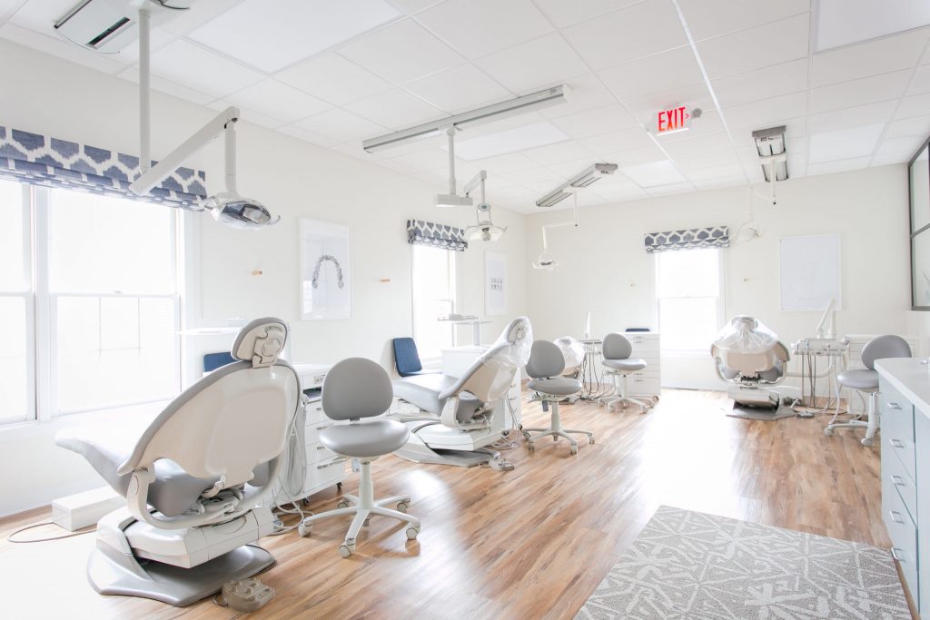
Paulus Orthodontics was a commercial project of ours. I’m sure many of you have gone to the dentist or orthodontist and can easily recall the sounds and feels of the space. Few are well designed, comforting spaces. They tend to be very sterile and “medical” and don’t necessarily put your mind at ease while you are waiting for your new braces or for a dental procedure. Our client did not want that to be the vibe here.
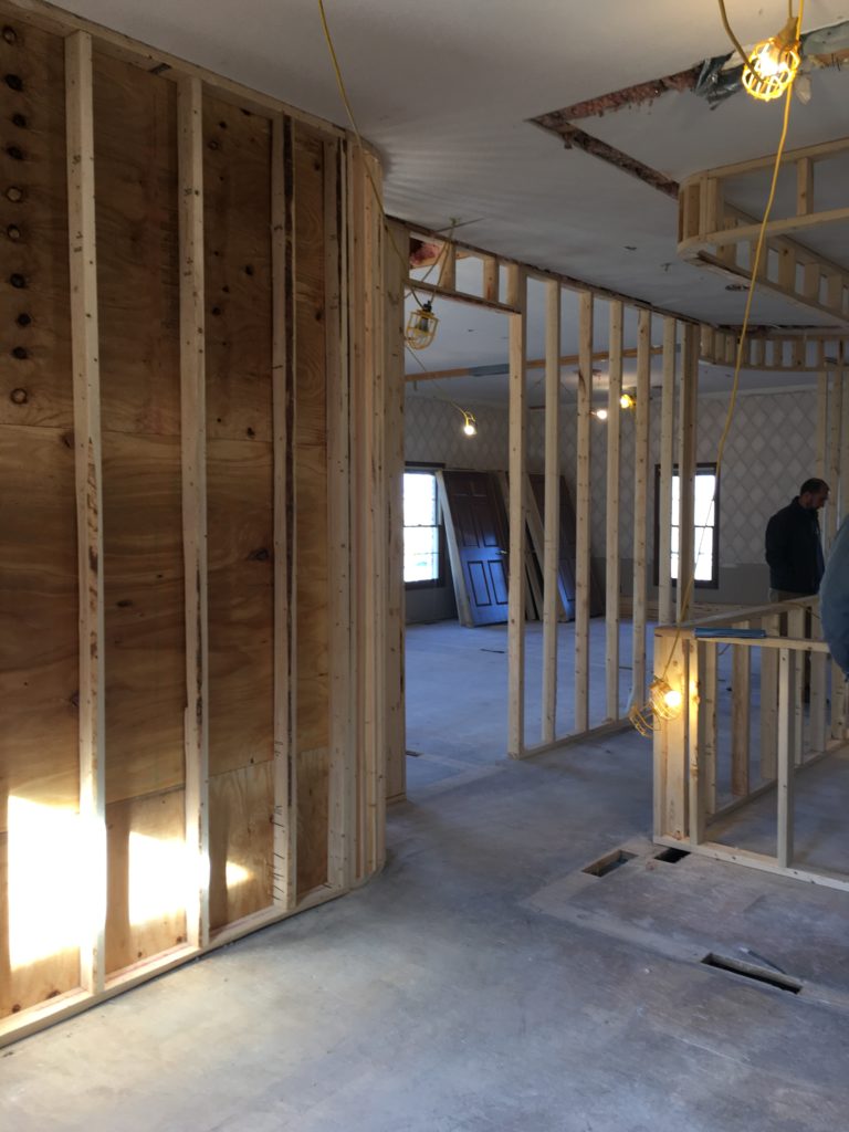

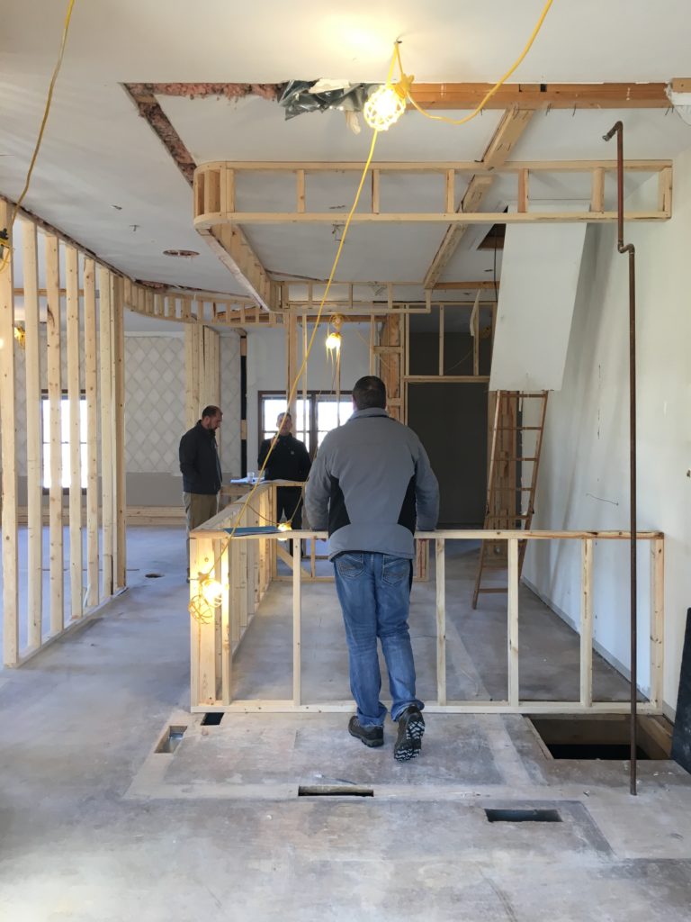
This project began with a vacant 1990’s office space. Did you know that today’s generation of kids call this time period the “late 1900’s”? Just to make you feel old for a second. Anyways, this space needed an update for sure. It became a light and airy office that features some design elements that you could imagine having in your own home. It is now a place to look forward to going. You might want to think about adult braces, just to enjoy the new Paulus office space.

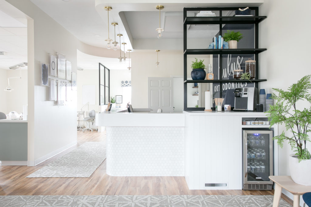
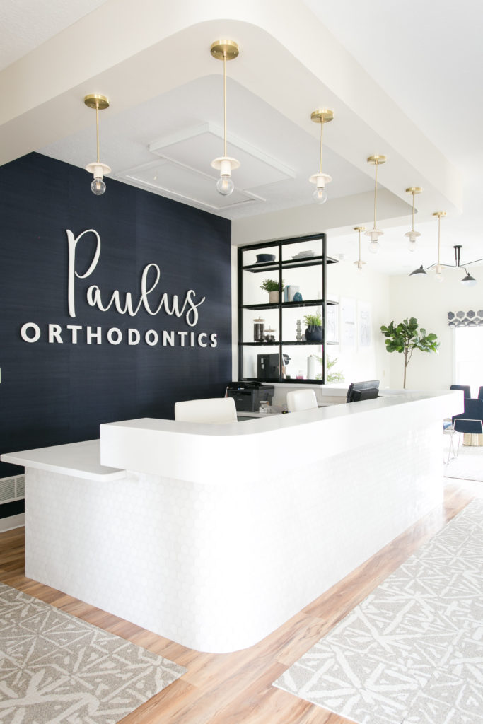
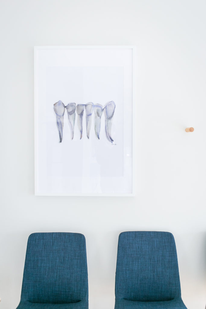
Our clients wanted the interior of the space to mimic their new logo and branding. It has clean lines and a navy blue color, so these were the elements that we used throughout. We began the base of this project with a pretty, mid-tone wood floor and paired that with a neutral and soft wall color. This neutral beginning allowed us to pull in the pops of navy and light blue which tie in the large scale logo that is a focal point behind the reception desk.


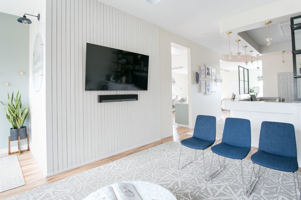
This entire office space is filled with practical and functional design, as it is a medical space, but we were able to add in several details that elevate it just a bit. For example, the reception desk area which I mentioned earlier. It features a thick solid surface countertop that gives it a custom-designed look. Beneath the counter, the desk area is covered completely with sparkling hexagon tile. It is neutral, but eye-catching and a bit of an unexpected element for an orthodontist’s office. Another unexpected design element is the vertical, wood-slat detailing found upon entering the space. It features a cool plexiglass logo, which is modern and updated while still serving its purpose of letting you know where you are.

One of my favorite “extra” parts of this project is the sleek black windows that divide the reception desk from the waiting room. We needed to add something here to separate the two spaces and add a bit of privacy for those patients checking in but, didn’t want either area to feel closed off. These clean-lined windows allow for privacy while letting the natural light flow through the entire space. They feature open shelving, which we were able to use to add some decor pieces to the waiting room side. You’ll also note the coffee bar that we added here to make the waiting area inviting and enjoyable.
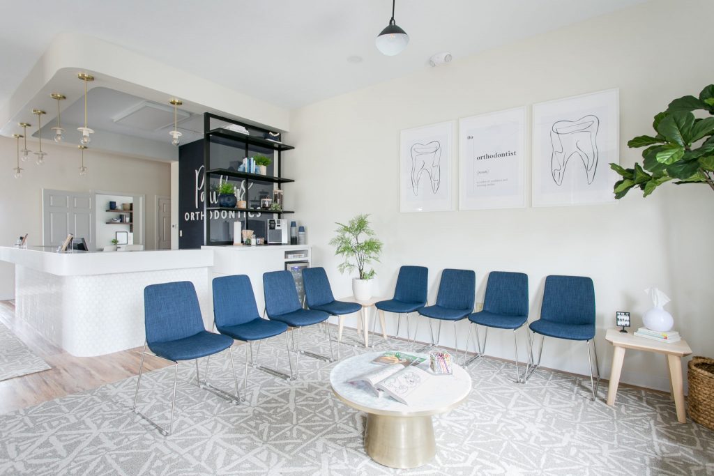
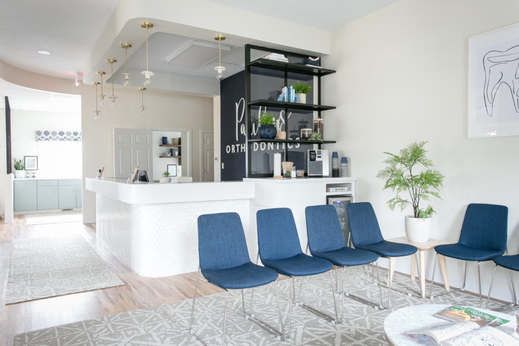
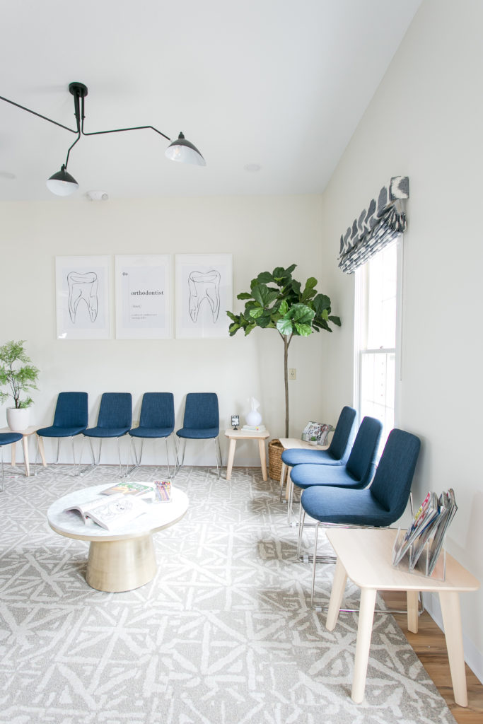
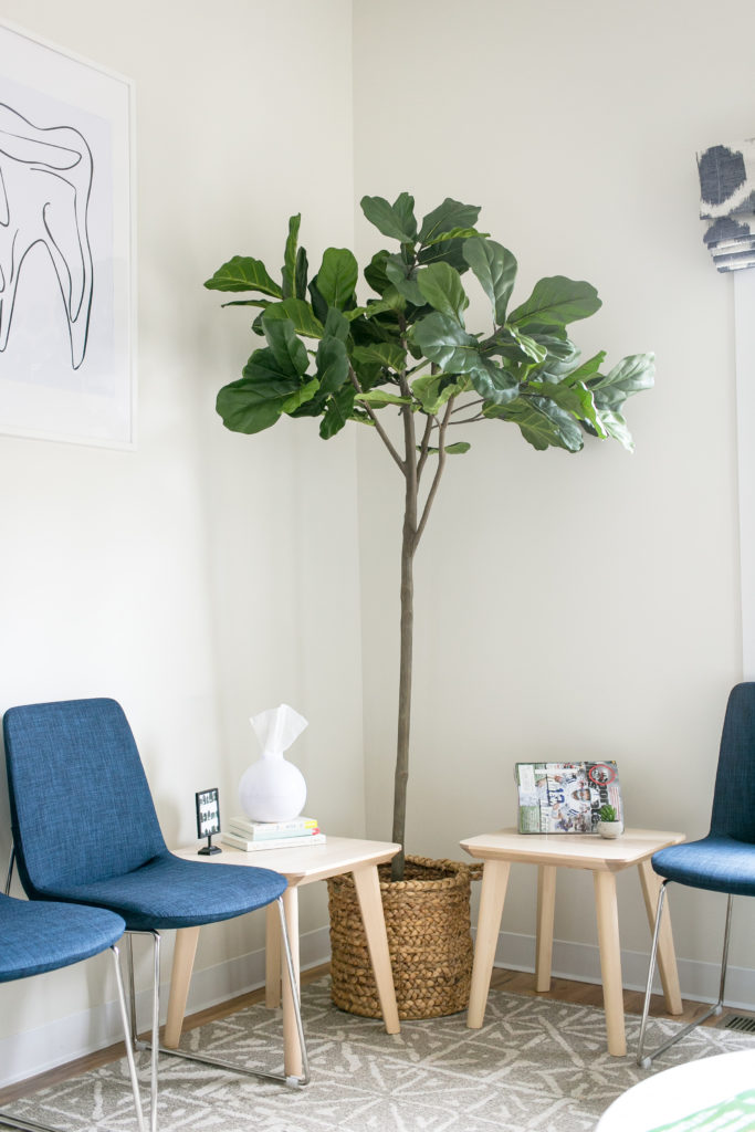
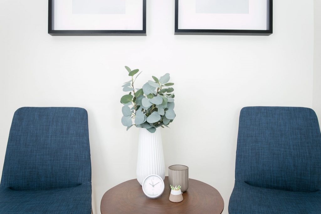
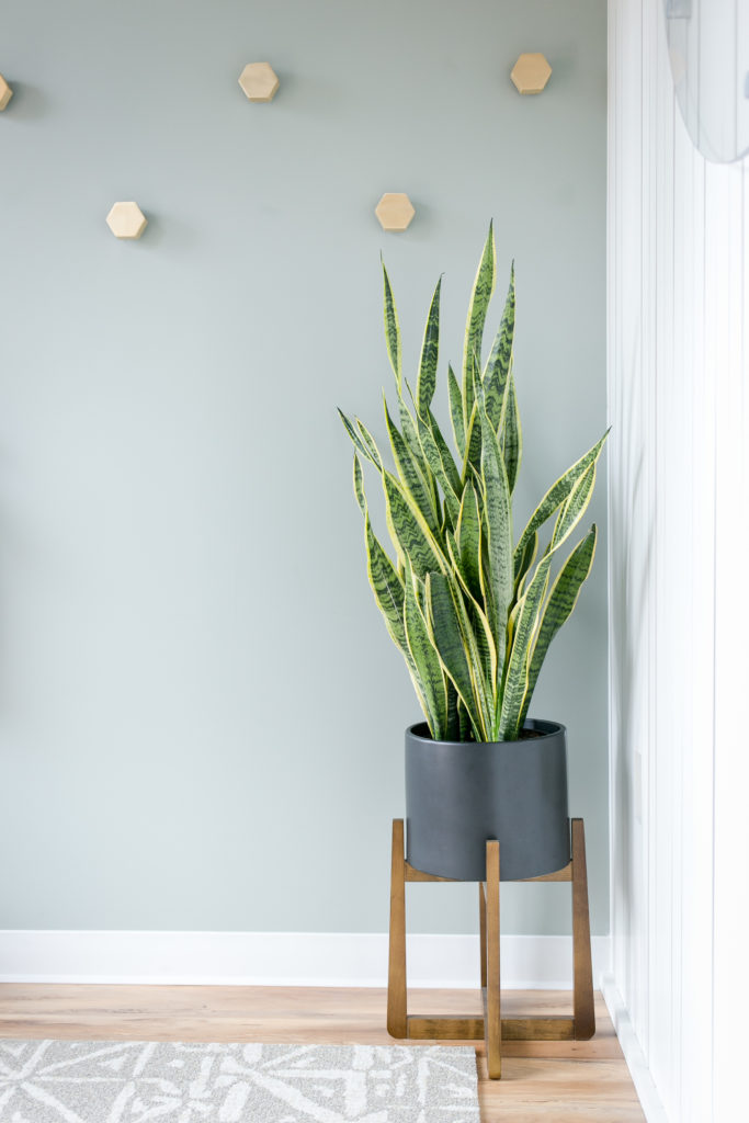
For the waiting room, we took a non-conventional approach by having it mimic more of a living room setting than a doctor’s office waiting room. We did this by using end tables and a coffee table that you might picture having in your own living room at home. Also, note the amazing ceiling mount light fixture in this area, the comfortable seating, and the large area rug, all of which make waiting for the orthodontist more comforting for the patients.
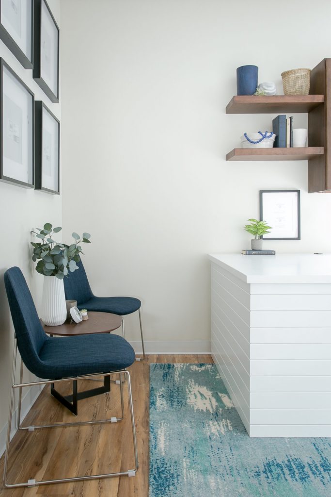
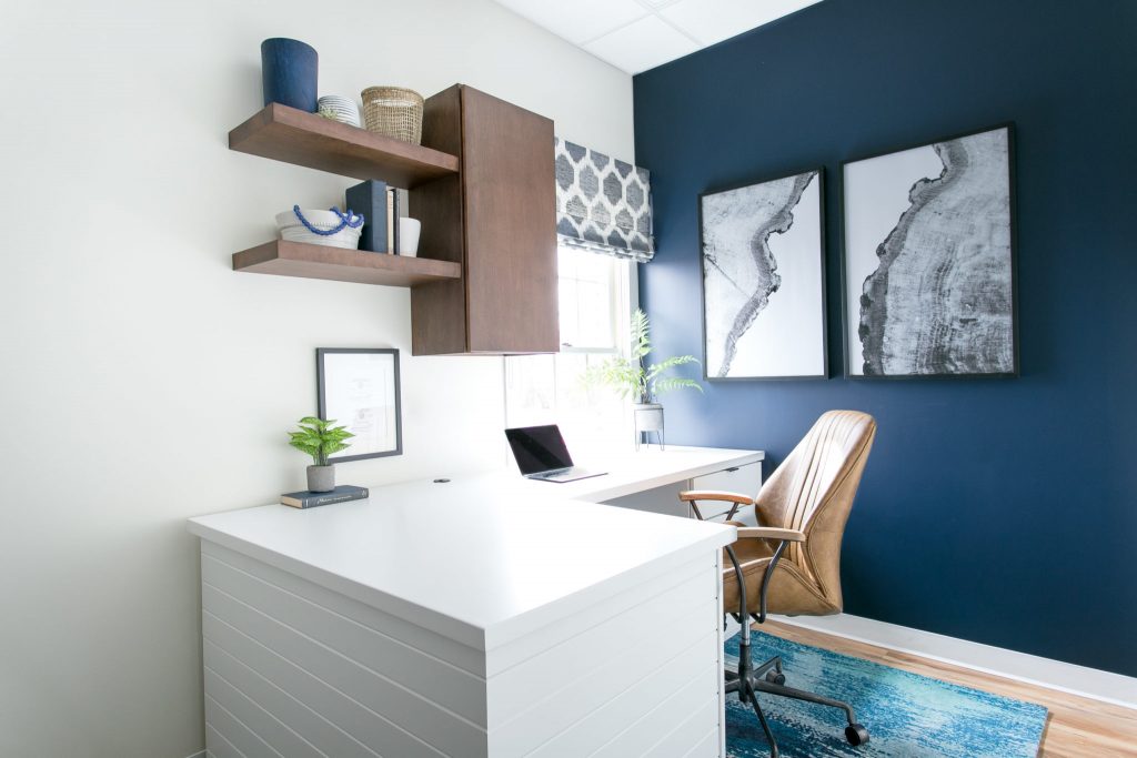
Finally, in Dr. Paulus’s office, we wanted the design to seem a bit more grown-up and added some masculine finishes. You can see this carried out in the deep wood tones of the cabinetry and the open shelving. This desk area, with its open shelving, was designed to function well, but also allow for some stylized decor to keep the space from feeling too stuffy. Additionally, we used a sharp brown leather chair to bring in some warmth and texture. The entire space is cohesive with the patient areas, but these few added elements set it apart for Dr. Paulus.

We hope you enjoyed this look at Paulus Orthodontic’s project. It’s proof that comfort and good design are not limited to the home.