Project Modern Victorian was so much fun and unique because we were working with an older house, a very old house! Because of the age of the house, there were just some quirks that needed worked out of the layout and additional space for the family was needed. We added a dining room, master suite, pantry, guest bathroom, mudroom, and foyer to the main floor. We also took the upstairs and made it into a space with 3 bedrooms, a full bathroom, a homework nook, and a hang-out space. There are few things we love more than making a home function well for the family that lives there!
This project was not as much a remodel as it was a restoration. Yes, we did some updating, but we actually took off things like the trim, window, and door casing, then sanded it down, refinished, and re-installed it. For the additions, we matched the trim, casing, and hardwood floor to what the house originally had to make sure the addition looked like it had always been there. This was a challenge, but it was a request we were happy to make happen!
A little side note for you as you read and look at these pictures. This client thrives when it comes to gardening and house plants, so please admire her landscape and house plants because they are beautiful! When doing this restoration we were inspired by her knowledge of topiary and asked her to write our last blog about garden planning. If you missed it you can read it here!
Enjoy!
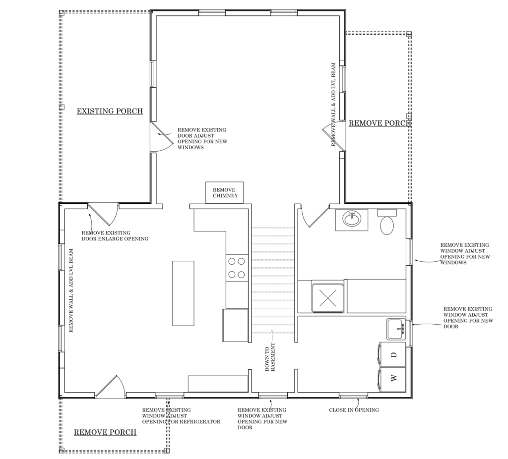
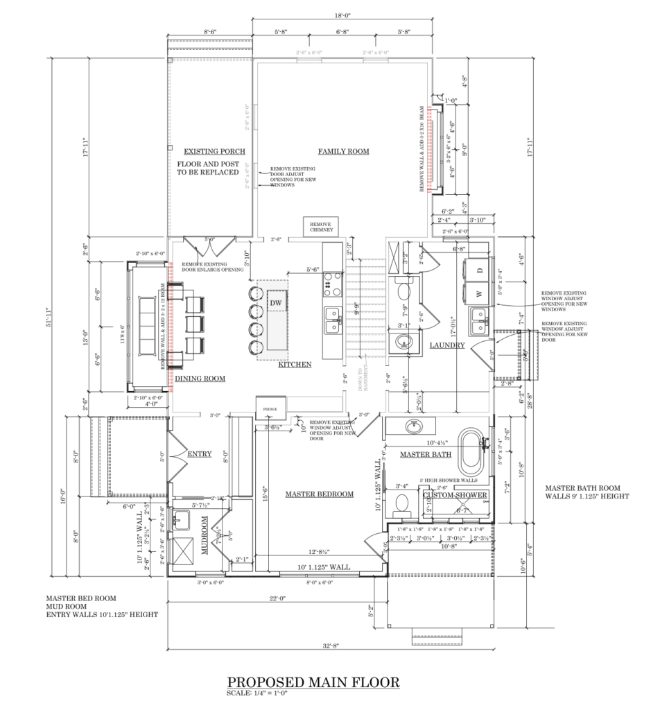
Floor Plan
Exterior
For the outside of the house, the clients really wanted to keep the home’s original Victorian architectural features. We got rid of the gray exterior and added new white siding. To create a pretty layered and monochromatic look we paired the white siding with new white trim and victorian detailed white windows.


Interior
For the interior design of this house the client wanted to restore old items in this house while still making the addition feel like it was always a part of the home. For the color palette of this home we used three tones of taupe. We included accents of aged brass and black and white tile as a nod to the architectural era. The wife and mom loves vintage finds so you will see this influence throughout her home. Our job was to create a beautiful blank slate, ready for her to curate with the pieces she had been waiting and saving to move into her new home.
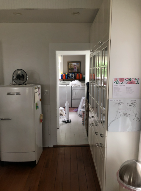
Mudroom
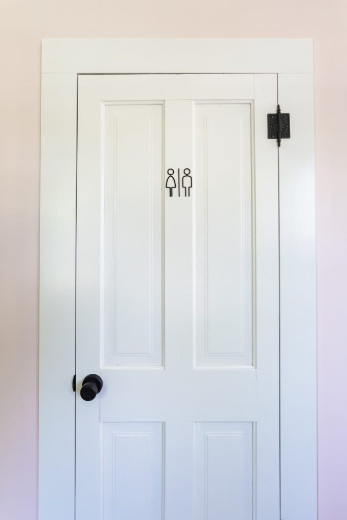
The client had a special request to have a dog bath area in the home, so in the mudroom we made it happen! Staying with the neutral color scheme that was being used throughout the home, we went with a white matte hexagon tile on the wall for the dog bath and sink. I love the natural tumbled texture of this floor tile! Because this is an older house it did not have a lot of storage so we tried to add some wherever we could. We were able to add a whole wall of storage in this room for the clients. As another nod to the restoration work we did, most of the interior doors, just like these were repurposed from the original home.


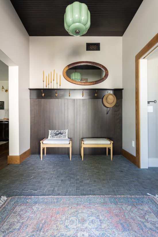
Entry
In the original design the main entry to the home came right into the living room. The clients asked if we could relocate the main entry and create an actual entryway for them. With the new addition that was added, we were able to accomplish this. We carried the tile floor that was used in the mudroom out into this area. The space is small and we didn’t want to take up a lot of space with lockers or built in cabinets so we opted for a wood shelf with coat hooks and two small wooden benches. This kept the design fairly simple so we added the vintage walnut bead board on the back wall and ceiling as a nod to the home’s Victorian roots. Let’s not forget that beautiful mint, milk glass pendant!
Kitchen
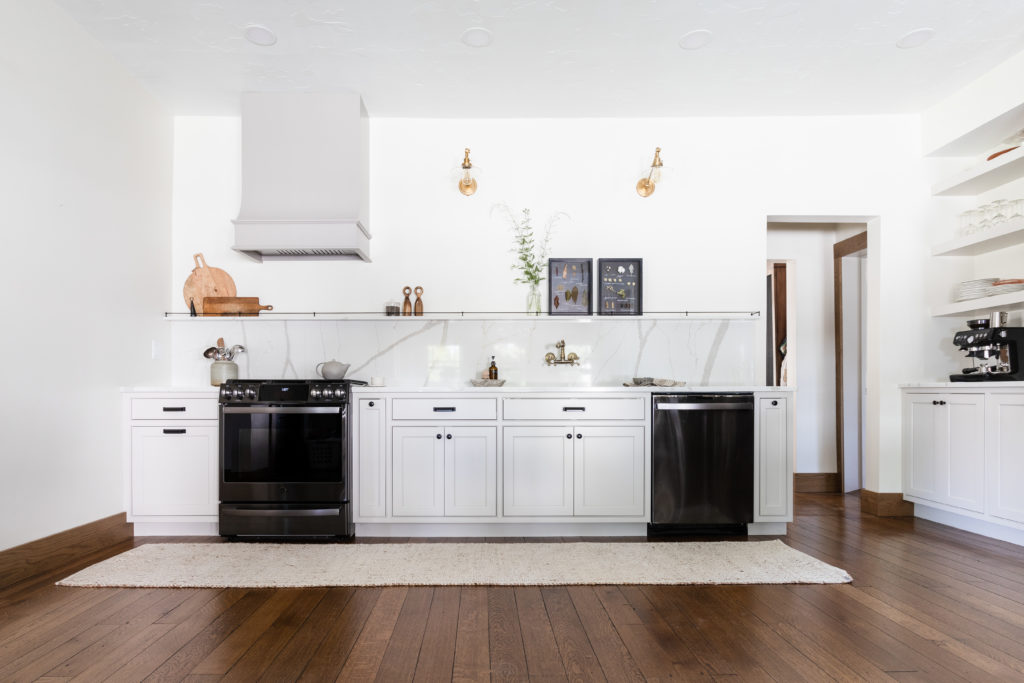
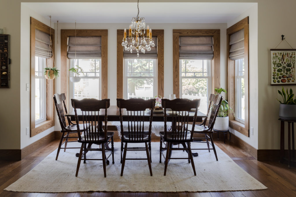
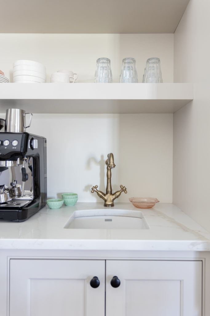
Onto the kitchen! The main goal for the kitchen was to open it up and create more space. There was an island in the middle of the room that was not necessary. We did lose storage by removing it, but to compensate for that we added a coffee bar area and a large pantry space just off the kitchen. The coffee bar was something the clients desired along with a dining area in the kitchen. To accomplish this without the kitchen being overcrowded, we added a bump-out addition to create a little nook area for the table to sit in. In this little nook, we packed in many windows, flooding the kitchen with lots of natural light. I also am a sucker for beautiful wood trim paired with soft cream walls and this dining nook is the perfect example of this timeless pairing!
Before
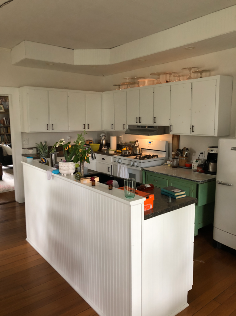
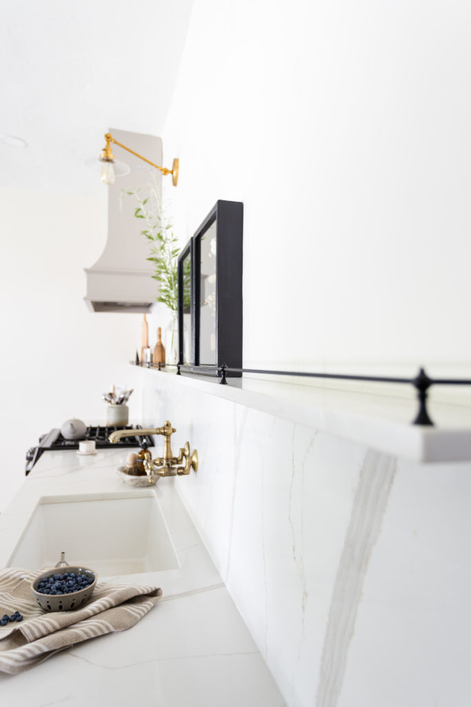
As mentioned before the clients wanted to reuse and restore what they could. One item that is hard to see in the pictures is the rich textural wall above the countertop. We left the original plaster walls and ceilings throughout the home. They are very authentic and gorgeous and add quite a bit of texture to the design that is hard to pick up in images. Another way the clients wanted to reuse and restore was a couple of the lighting fixtures. The original ones they had were brass so we added more brass detailing throughout. In the kitchen, we added brass faucets and brass sconces. One of our favorite things that we added in was the intricate plate rail on the floating shelf, it is reminiscent of the Victorian era characteristics.
Pantry
The large pantry area is located just off the kitchen. This was once again, another beautiful and one-of-a-kind vintage find by the clients!!
Before
After
Laundry
In the laundry room, we love the asymmetric vintage green milk glass light. It visually balances out the large floating shelf of plants. I love the mixing of brass and porcelain knobs on this vanity moment, it really just pulls the space together.


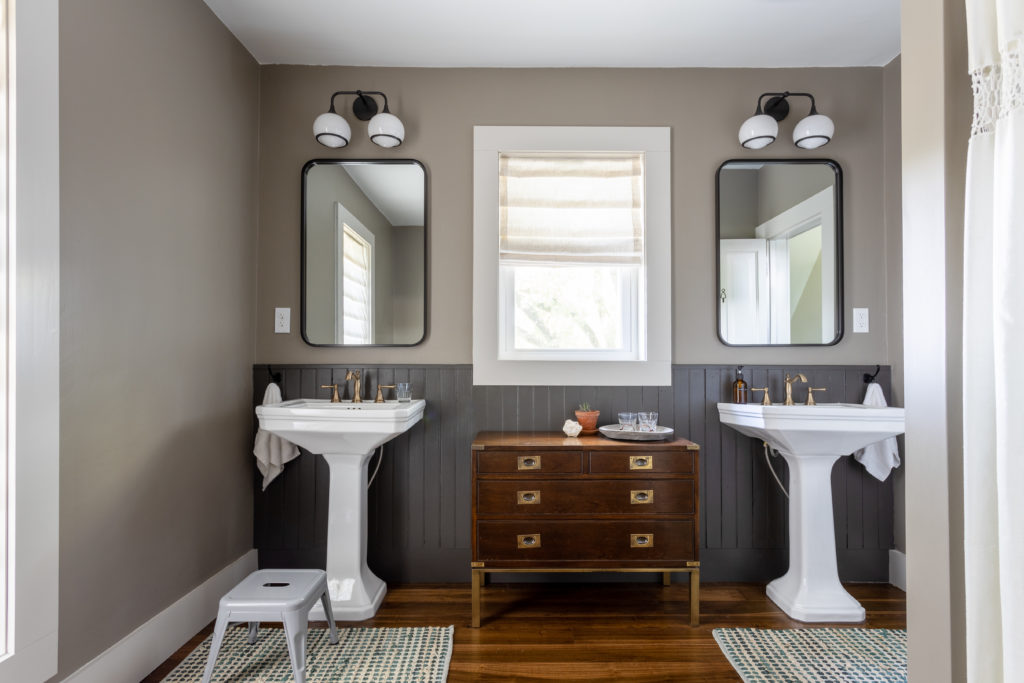
Guest Bathroom
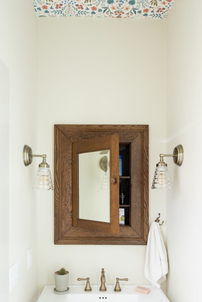
For the Guest Bathroom, we were able to reuse the old doors and the client had saved this old medicine cabinet with a mirror which was perfect for the space!
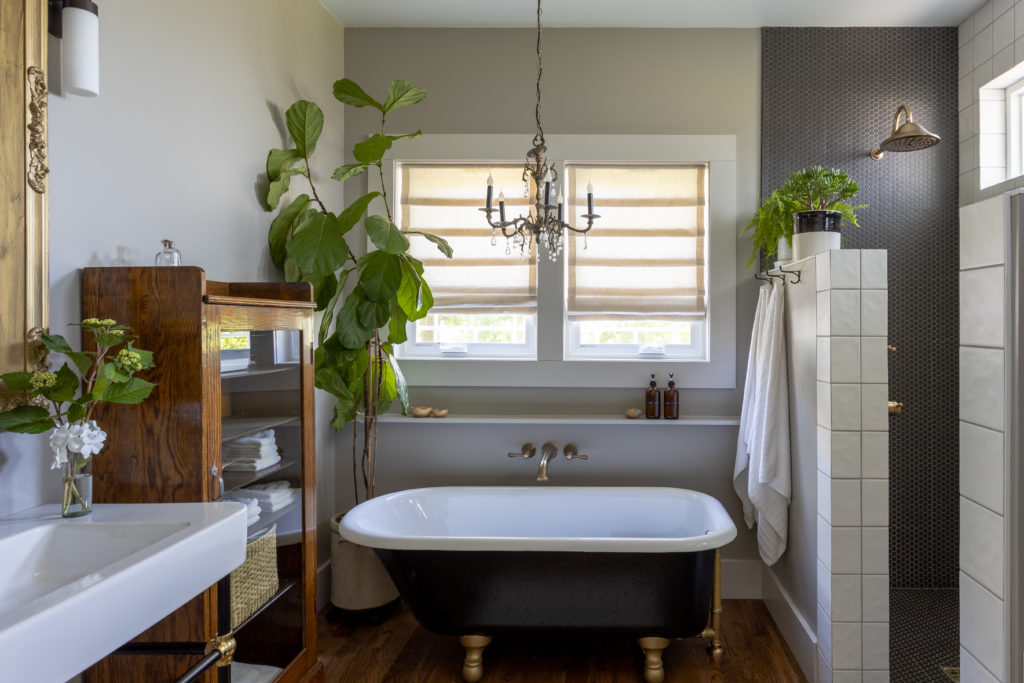
Master Bed & Bath
The Master suite was a completely new addition. We continued the hardwood floors throughout to help it feel authentic to the rest of the house. Our client liked the idea of the open washstand style vanity. We love how it pairs with her clawfoot tub that she refurbished. Speaking of the tub, I love the 6″ ledge we built out of the wall to create a storage shelf. It is very minimalistic and equally functional. We also left a space in the bathroom for a vintage wood cabinet the client had waiting as a beautiful storage piece. For the shower, we lowered and widened the shower walls so she can set her plants there. We wanted to pick a tile in the shower that compliments the color of the clawfoot tub. Again, we carried the brass accents throughout.
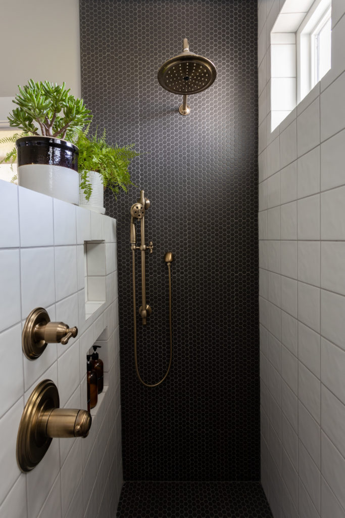
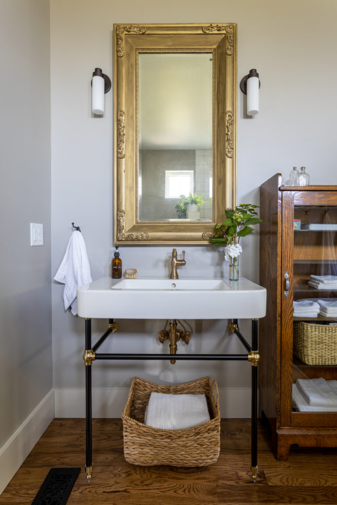
Notice the hidden soap niches and the conveniently placed shower valves. We hide soap niches to help your shower look neat and tidy. We try and place all shower valves right at the entrance but still close to the shower head so the water can be turned on without having to stand directly in the shower.
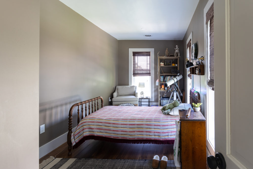
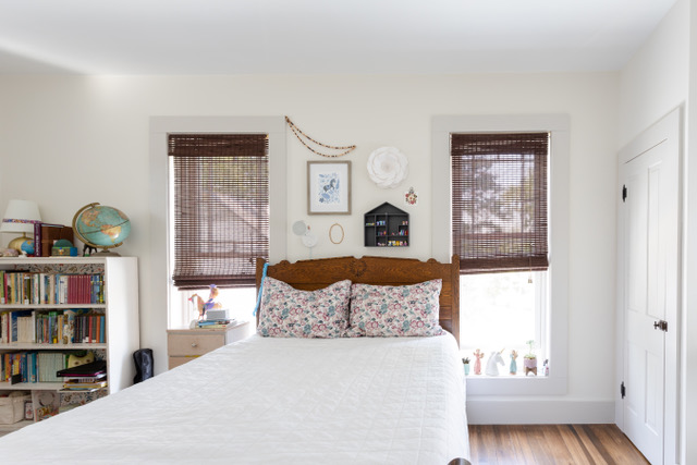
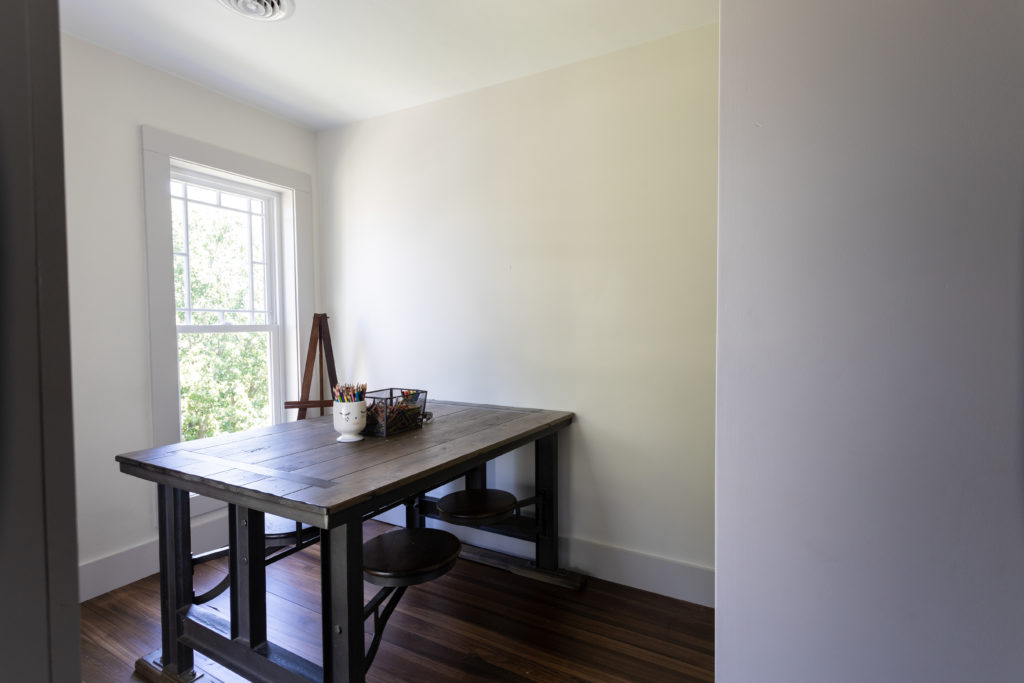
Upstairs
Floor Plan
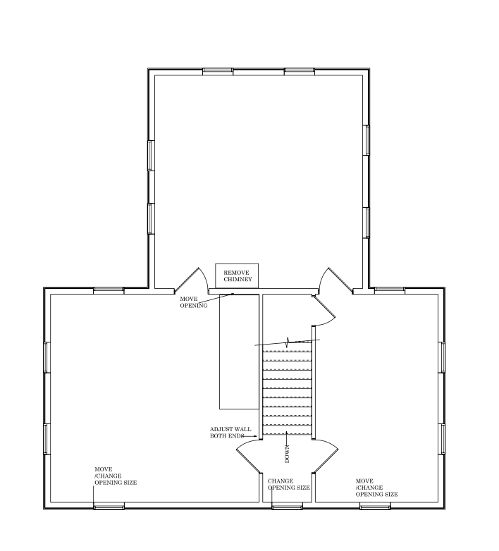
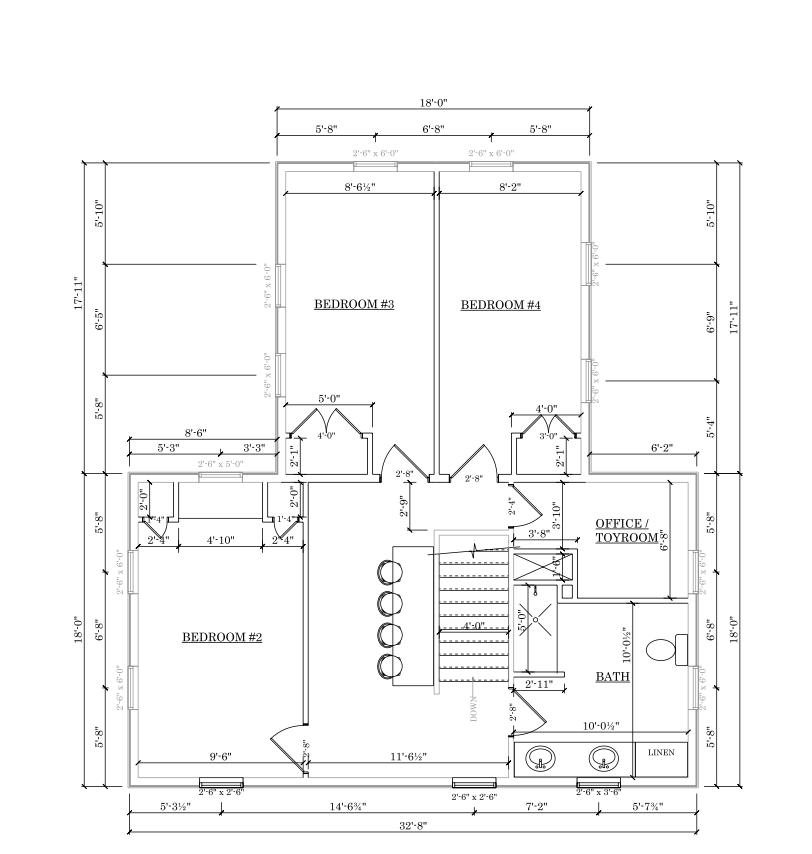
For the upstairs, we took what was originally 3 bedrooms and divided the space into 3 bedrooms, a full bathroom, homework nook, and hang-out space. We loved being able to make the upstairs function better for the family that lives there. As we said before, our job was to create a blank space for the clients to make their own. For the upstairs, we love the way each child’s room turned out and how it reflects their personalities.
Before


After
I hope you enjoyed this project reveal! As said at the beginning, this was a restoration and something we will gladly take on. We love new challenges and expanding our knowledge in the interior design and building world! There is something special about taking the old and making it new while paying homage to its original roots. We hoped you feel inspired by this ModernVictorian. It makes us excited for a rainy day spent indoors reading, puzzling, and playing!
Don’t forget to follow us on social media and sign up for our email blasts here to be the first to know about project reveals, learn our favorite design trends, and see what we are currently working on.